Isn’t it amazing how much Mexico looks in no way like north-eastern Austria? But Mexico is hot, and here we’re taking a look at heat mapping..
Having recently seen demos on both hexagonal heat maps and the Qgis2threejs plugin, I set myself the task of updating an open data hexagonal heat map project to create an online 3D visualisation. Anita Graser used tree count point data from Vienna’s open data initiative to create simple, effective heat maps showing the variation in tree numbers across Vienna. A top-down map is simple and effective, but with good mapping and height data available, there was an opportunity to increase the visual and interactive elements.
3D is just about pretty visuals, 2D is where real analysis happens.
I was at a 3D visualisation workshop recently, and that quote came up. It’s easy to agree, and although I’m a little sceptical about the need for 3D visualisation in many contexts, a simple variation in height for values here seemed a suitable display for tree data. In fact, this context helps to highlight another potential application, and one which is a simple step away: using individual tree count records to visualise a wooded landscape. A basic tree structure formed from a cylinder and cone can be surprisingly effective at exploring scenarios for wooded landscapes, something I explore in Part Two.
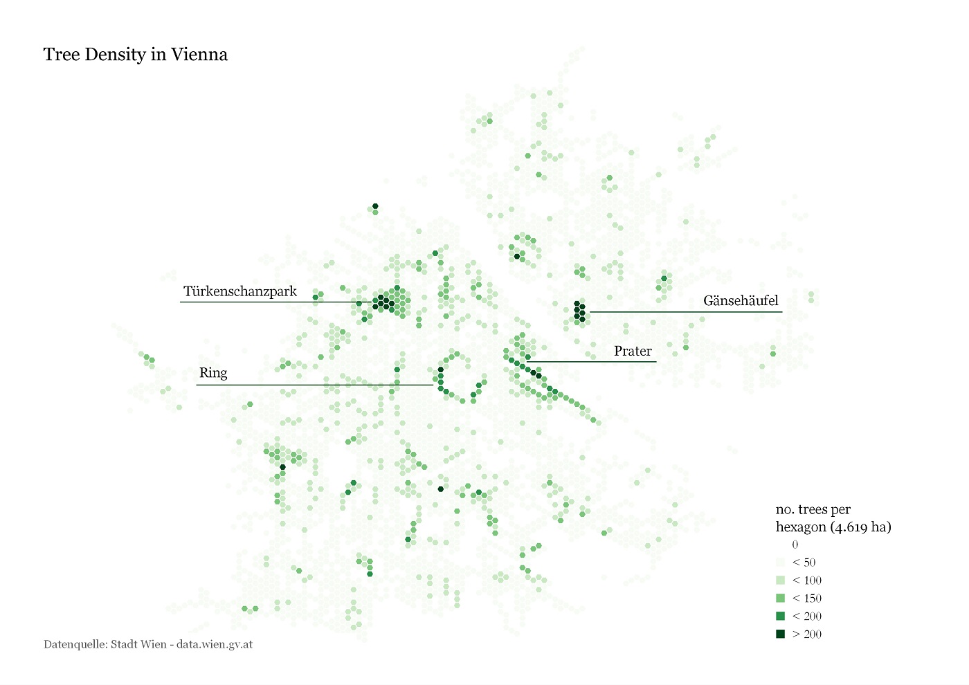
Anita Graser’s 2D tree density map was my inspiration.
Perhaps the example I’m creating here is one of a visually stimulating method for distributing data, rather than any grandiose attempt at shifting the paradigm (ha!) – 3D has its place, but it’s by no means the future of 2D. To add this visual stimulus to the data, a backdrop map and a digital elevation model (DEM) would be required. Using a darkened version of the Stamen Toner OpenStreetMap layer as a stylised backdrop, I gave it elevation using a freely-distributed 5m DEM of Vienna.
We now have a realistic background to drop our layers onto, so it’s time to get our tree point values and create the ‘heat map hexagons’ to summarise (count) our data with.
First up, let’s get the tree data. It’s worth noting that in order to get these tree count values in their entirety, you’ll need to edit the default feature request on the open.wien.at download page. If you want a .shp, just right-click the download link and copy it, then change it from:
http://data.wien.gv.at/daten/geo?service=WFS&request=GetFeature&version=1.1.0&typeName=ogdwien:BAUMOGD&srsName=EPSG:4326&outputFormat=shape-zip&maxfeatures=50
to:
http://data.wien.gv.at/daten/geo?service=WFS&request=GetFeature&version=1.1.0&typeName=ogdwien:BAUMOGD&srsName=EPSG:4326&outputFormat=shape-zip&maxfeatures=200000
with the upping of the max features being the only necessary change. This new request will take a minute or two to generate a zip file to download, but will get all the data out (over 154,000 tree points).
Once we’ve imported that to QGIS, we can make our hexagons. MMQGIS is our friend here, creating hexagons over the viewport with the MMQGIS > Create > Create Grid Lines Layer, changing the rectangle option to hexagons, and fiddling with the settings until the size and number of the hexagonal output is what you desire.
Then it’s simply a case of counting the points: Vector > Analysis Tools > Points in Polygon, and we’re ready to visualise. Turn of all your feature layers, then open up qgis2threejs and set the DEM (it should have defaulted to it), then turn on the hexagonal count data and change the Z Coordinate Mode to the count attribute in your data. Play around with the settings and results, and you’ll end up with something like this:
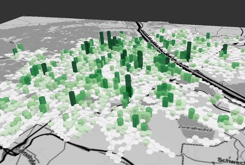
The final outcome is a fully interactive 3D web visualisation [click to load].
Data points, adding planes
Not only can you turn layers on and off, but you can start to explore the datasets with a click of the mouse. A click will add a yellow point and you’ll get the location as well as the value (“Z”) in a popup box. Turning a layer off will allow you to query the layer below in the same way. To explore the variation in height across the data, you can also add a coloured plane, best imagined as sea-level rise (quite unlikely to affect Vienna, but hey!). Take off the tree count layer and add a plane, then vary its heigh to explore the topography of the city, as below:
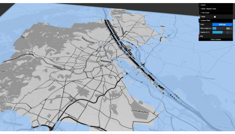
The DEM and three.js making simulating water level rise easy [40m steps]

Data:
- Tree count point data from Offene Daten Österreichs
- 5m Digital Elevation Model (DEM) of Vienna from the Open Data Portal
QGIS Plugins:
- MMQGIS – used to create hexagonal polygon layer
- OpenLayers Plugin – adds the map background
- Qgis2threejs – does the web visualisation
Part Two: Visualising Landscapes
As someone who until recently worked in forestry, it struck me this would be quite a simple way of visualisation the changes to a landscape that forestry can bestow. With a set of points representing individual trees, or forested areas combined with planting density information, trees could easily be simulated in 3 dimensions using the same plugin. With variations in height – say growth rates per species – a time-lapse series could easily be animated also.
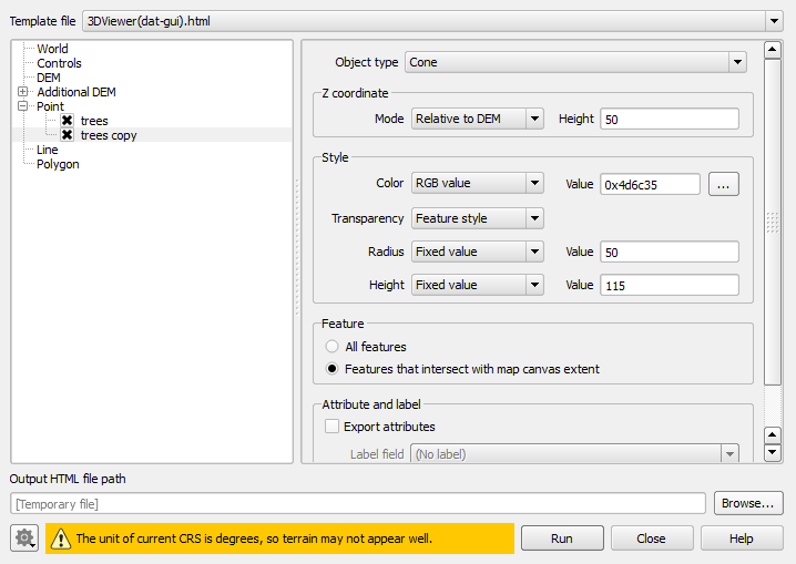
To document the simplest form of this technique, I created a shapefile with a set of points to represent 3 tree stands near Coulport in Scotland. Then I added google satellite imagery from the OpenLayers plugin and downloaded a UK DEM. To simulate trees simply, just take duplicate your points shapefile and turn both off (so the points themselves don’t appear on the map). Then using the qgis2threejs settings, use one layer to make brown cyclinders of a set height, and the other to create green cones starting at the top of the cylinders. [see the settings images below for an example]
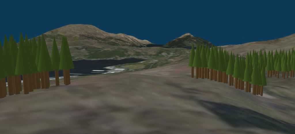
The result.. (I’ve scaled things up a bit here for impact)
This was only a 10-minute job, but it shows the possibilities. With a bit of work, this could be automatically linked to a multi-species growth model and three.js could be used to ‘grow’ the stands into the future, with a fully interactive application for the target audience. I’ve seen expensive and complicated systems that do this kind of thing for predicting environmental impact, but this could be a cheap, effective alternative.
No new plugins here, but I did search for a decent, free DEM for the UK, so here’s a link to that..
Data:
- 90m UK Digital Elevation Model (DEM) from Offene Daten Österreichs
Example settings:

Appreciate the recommendation. Will try it out.