OK, I’m trying to make this topic sound fun.. but there’s only so many ways you can spin online charting libraries.. but if they make delicious donuts and colourful dots, then I might have a chance (hmm). Here I take a look at chart.js and C3.js, the latter being based on D3.js, which is well worth checking out for some made visualisation libraries.
There are plenty of javascript libraries out there..
Wanting to explore some new(ish) charting libraries, I set upon documenting the recent European elections with donut graphs, for my local and wider area. After a run-through of potential libraries, focusing on aesthitics, compatability and use of HTML5, I set upon using doughnut pie charts.
There are quite a number of chart options and they’re all pretty simple and intuitive. I didn’t explore too much, but it seemed like going into the code and altering them might be a bit of a pain, but if they’ll work for you out the tin, they’ll give great impact to your data.
There had just been a European election with some interesting changes taking place. The data was out there and a comparison between my constituency, Scotland and the UK could be made, for this election and the one prior. Perfect data for this task, and potentially useful too.
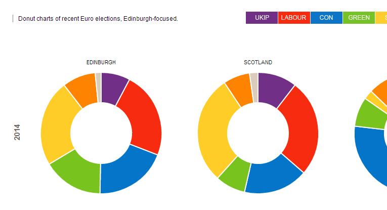
Simple, colourful, inedible donuts. 🙁
I won’t go into the ins and outs of linking the data to the javascript library, but it wasn’t complex – it’s best just to click on the demo and see what you think:

Finally, with the data coming from an open source, and lots of sites seemingly forgetting to tell you where their data came from, I added simple attribution data at the bottom of the page. It’s amazing how this seems to slip from people’s minds around election time 😉
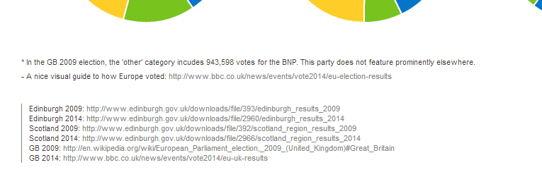
Simple source info at the foot, links to open data.
Done.
Part Two: C3.js for graphin’
Now a quick look at what C3 can offer. This is more the graphing side of things and came in handy to help visualise stats from the tastings at the Southside Whisky Club. We individually rate each bottle we taste and after 100+ bottles, it became interesting to see how our scores have varied over time.
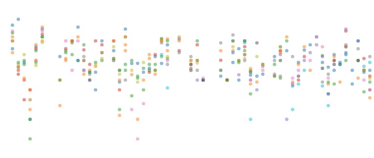
Colourful dots for slightly dry stats..
Taking these scores and putting them into a scatter plot, you can see how things have varied per bottle, and over time, and by hovering over an individual’s name at the bottom, you can isolate their scores too.
It works pretty well, and there are lots of handy graphs ready-made for different types of data (it handles time-series particularly easily and well).
Both libraries are easy to plug data into and to get nice effects. To get the most out of both, it helps to be able to fiddle the code behind the scenes, with C3 offering more options in that regard. Hopefully they’ll bring a bit of brightness to your data!