There have been a lot of articles showing up in and around the US election result either calling for the abolition of the electoral college based on its unfair representation of the populous, or the fact that the system itself is institutionally racist (sometimes this is documented as black Americans not getting a fair vote, sometimes as racist white Americans getting more votes – go figure). Wikipedia can provide you with an extensive guide to the electoral college system.
But whatever the talk, is it a fair system? Below are 4 maps that help tell that story.
Just before we begin, population / ethnicity data was downloaded from EOSDIS, state boundaries were downloaded from census.gov and all maps are projected using the US National Atlas Equal Area projection (EPSG:2163), detailed here. All analysis was performed in QGIS 2.14 Essen.
First up, let’s look at how the number of electoral college votes varies across space:
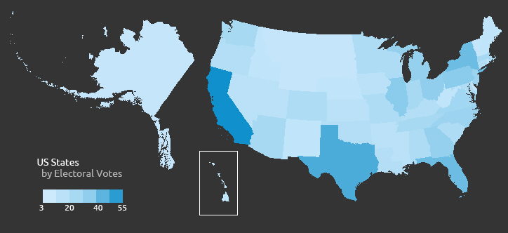
US Electoral College Votes by State
In order for this to be representative, you would expect a map of state populations to be broadly similar in pattern, which it does appear to be:
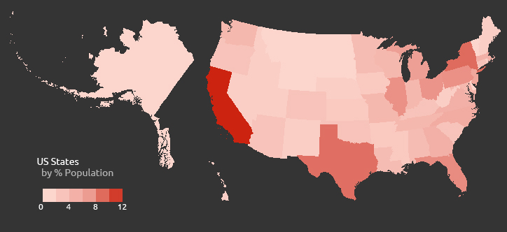
US State Population as Percentage of Total
But let’s tease out the variation in the data by seeing how many people an electoral college vote represents for each state (there’s more variation than you’d think).
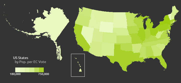
US Population per Electoral College Vote
And finally, does this inequality show any obvious pattern? Below is a map of each state’s percentage white ethnicity (Hawaii is an outlier here) – does the spatial pattern below match that above? It’s certainly not a clear picture:
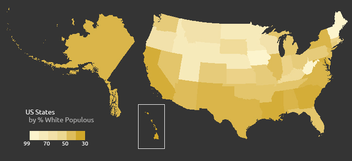
US White Populous Percentage per State
From this quick spatial analysis, you can get an idea of how votes are split across the US States, across population densities and across ethnic diversity. The standout message appears to be the wide variation of people-per-vote, but the pattern seems somewhat more random than some suggest. For those calling for proportional representation though, it still provides evidence to support their case.
Hi Phil, have you looked for correlation between white population and US Population per Electoral College Vote?
Hi Jordan. Not statistically, but the bottom 2 maps suggest the relationship wouldn’t be strong.
Is Alaska really that big?? P.S. good maps!
Hi Iain. Alaksa is pretty big – it’s almost exactly 4x the area of California. There will be some distortion on these maps as all states are projected using the US National Atlas Equal Area projection, which favours accuracy of area across the continental US (see here: https://source.opennews.org/en-US/learning/choosing-right-map-projection/). As always, it’s a battle between consistency and accuracy, but it’s not too bad. FYI, this is a nice tool showing differences in various global projections: https://bl.ocks.org/syntagmatic/ba569633d51ebec6ec6e